Climate Change

Climate change and temperature anomalies
If we wanted to study climate change, we can find data on the Combined Land-Surface Air and Sea-Surface Water Temperature Anomalies in the Northern Hemisphere at NASA’s Goddard Institute for Space Studies. The tabular data of temperature anomalies can be found here
To define temperature anomalies you need to have a reference, or base, period which NASA clearly states that it is the period between 1951-1980.
weather <-
  read_csv("https://data.giss.nasa.gov/gistemp/tabledata_v3/NH.Ts+dSST.csv",
           skip = 1,
           na = "***")
tidyweather <- weather %>%
select(-c("J-D", "D-N", "DJF", "MAM", "JJA", "SON")) %>% # select relevant columns
pivot_longer(cols = 2:13, names_to = "Month", values_to = "delta") # make data frame tidyPlotting Information
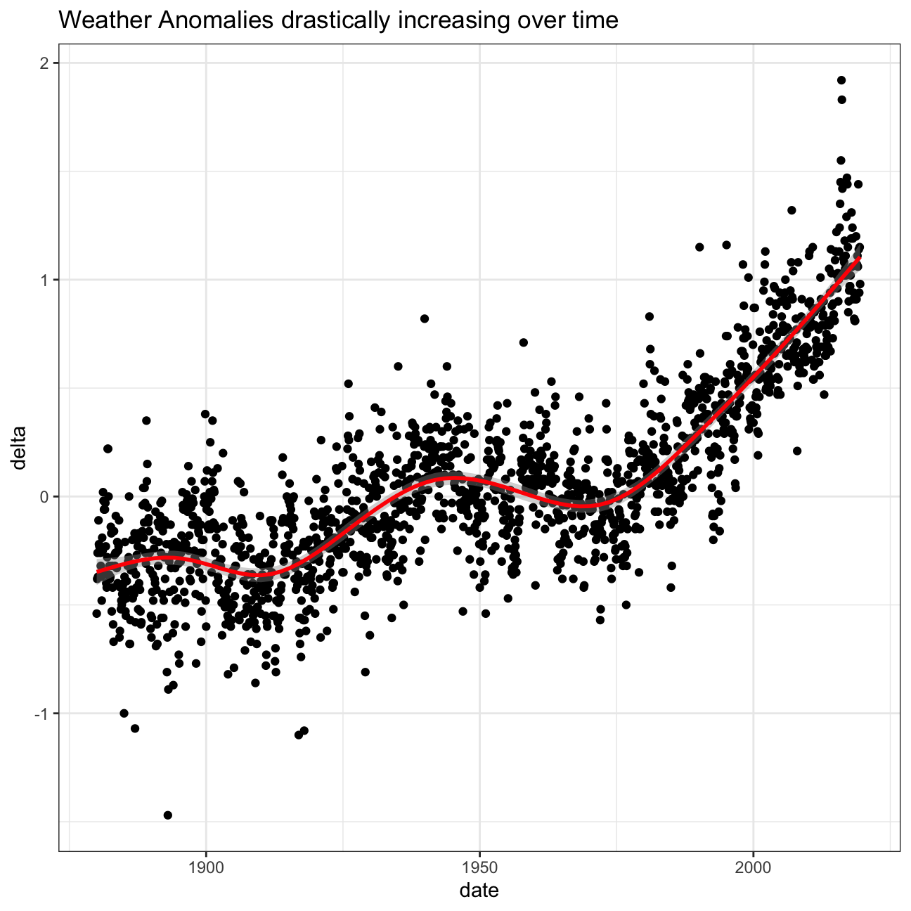
Let us plot the data using a time-series scatter plot, and add a trendline. To do that, we first need to create a new variable called date in order to ensure that the delta values are plot chronologically.
tidyweather <- tidyweather %>%
  mutate(date = ymd(paste(as.character(Year), Month, "1")),
         month = month(date), #had to get rid of label = true. TA advised could be a package loading problem
         year = year(date))

ggplot(tidyweather, aes(x=date, y = delta))+
  geom_point()+
  geom_smooth(color="red") +
  theme_bw() +
  labs (
    title = "Weather Anomalies drastically increasing over time"
  )
Is the effect of increasing temperature more pronounced in some months? Use facet_wrap() to produce a seperate scatter plot for each month, again with a smoothing line. Your chart should human-readable labels; that is, each month should be labeled “Jan”, “Feb”, “Mar” (full or abbreviated month names are fine), not 1, 2, 3.
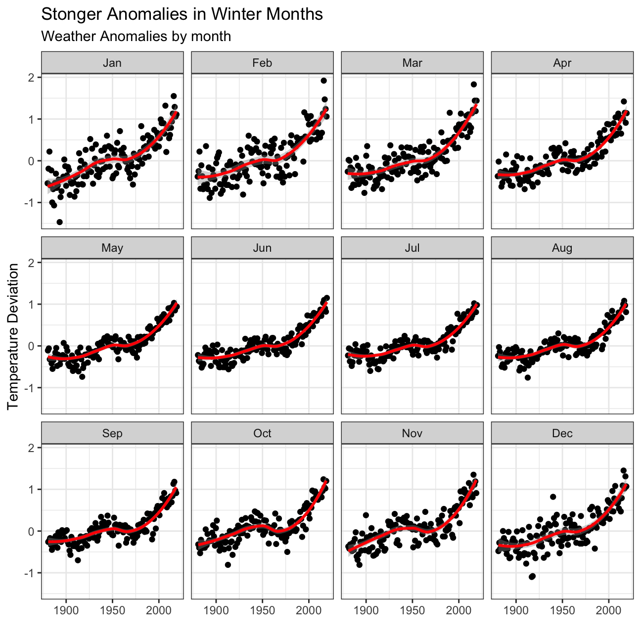
- We can see that the weather anomalies are more pronounced in the winter months!
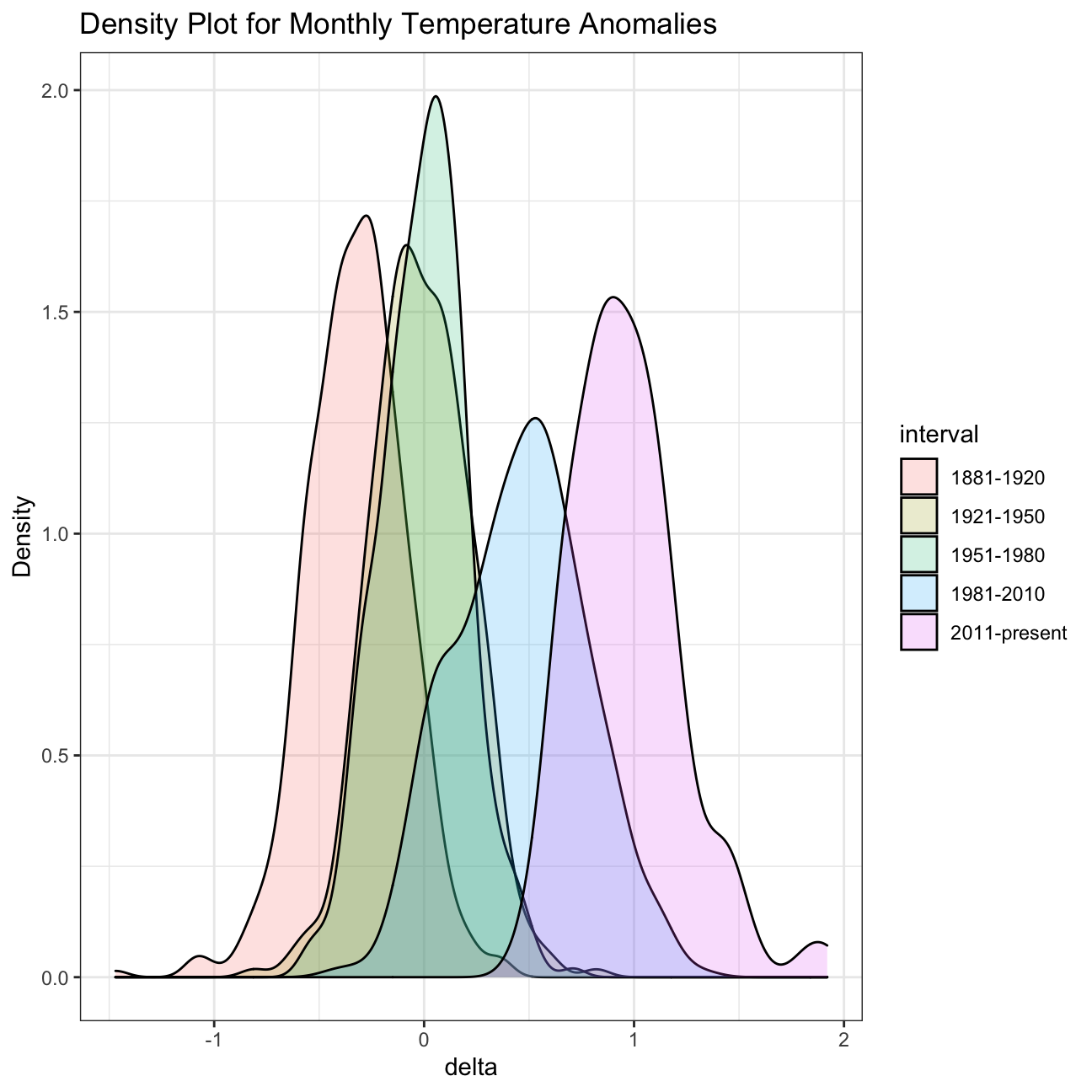
It is sometimes useful to group data into different time periods to study historical data. For example, we often refer to decades such as 1970s, 1980s, 1990s etc. to refer to a period of time. NASA calcuialtes a temperature anomaly, as difference form the base periof of 1951-1980. The code below creates a new data frame called comparison that groups data in five time periods: 1881-1920, 1921-1950, 1951-1980, 1981-2010 and 2011-present.
We remove data before 1800 and before using filter. Then, we use the mutate function to create a new variable interval which contains information on which period each observation belongs to. We can assign the different periods using case_when().
comparison <- tidyweather %>%
  filter(Year>= 1881) %>%     #remove years prior to 1881
  #create new variable 'interval', and assign values based on criteria below:
  mutate(interval = case_when(
    Year %in% c(1881:1920) ~ "1881-1920",
    Year %in% c(1921:1950) ~ "1921-1950",
    Year %in% c(1951:1980) ~ "1951-1980",
    Year %in% c(1981:2010) ~ "1981-2010",
    TRUE ~ "2011-present"
  ))
Now that we have the interval variable, we can create a density plot to study the distribution of monthly deviations (delta), grouped by the different time periods we are interested in. Set fill to interval to group and colour the data by different time periods.
ggplot(comparison, aes(x=delta, fill=interval))+
  geom_density(alpha=0.2) +   #density plot with transparency set to 20%
  theme_bw() +                #theme
  labs (
    title = "Density Plot for Monthly Temperature Anomalies",
    y     = "Density"         #changing y-axis label
  )
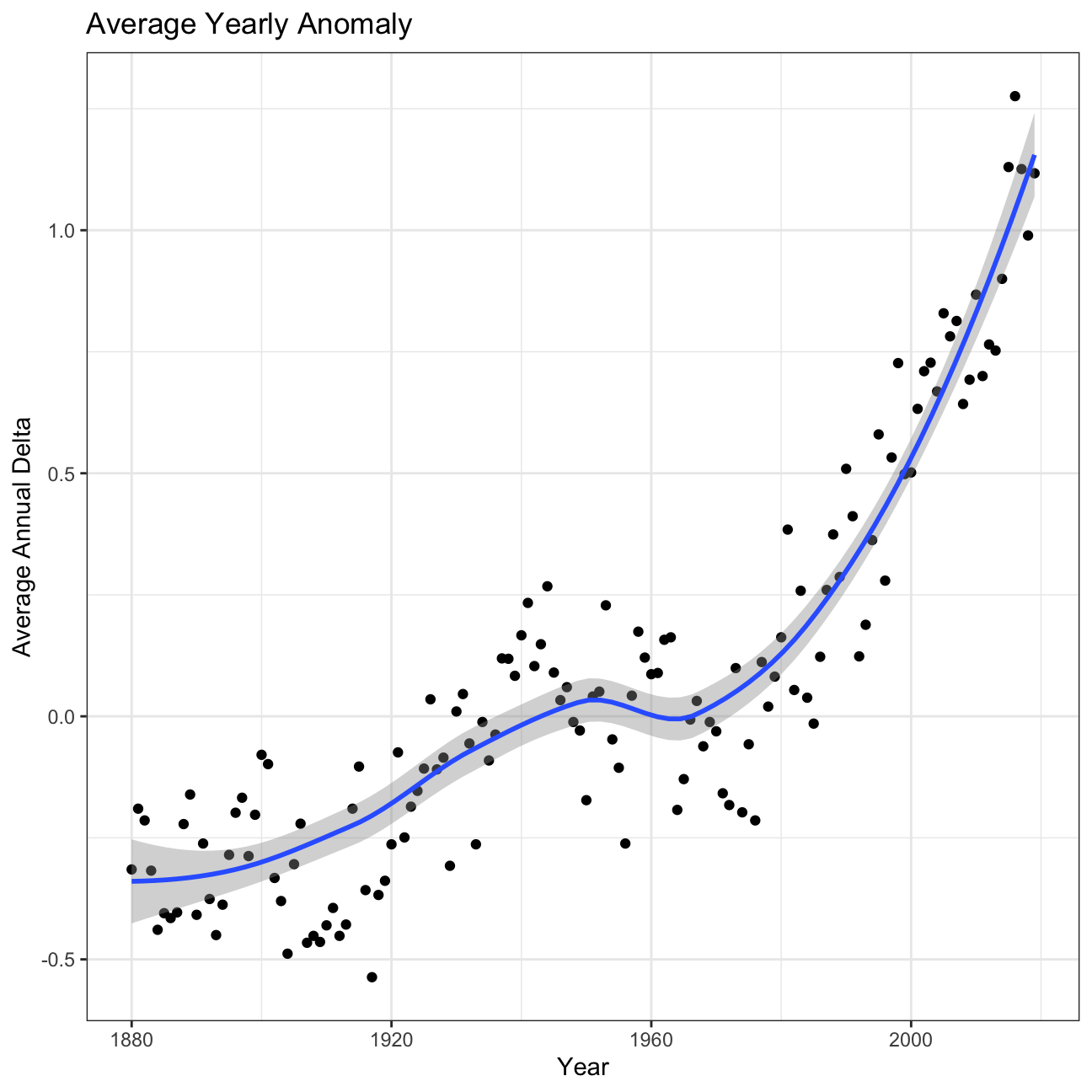
So far, we have been working with monthly anomalies. However, we might be interested in average annual anomalies. We can do this by using group_by() and summarise(), followed by a scatter plot to display the result.
#creating yearly averages
average_annual_anomaly <- tidyweather %>%
  group_by(Year) %>%   #grouping data by Year

  # creating summaries for mean delta
  # use `na.rm=TRUE` to eliminate NA (not available) values
  summarise(annual_average_delta = mean(delta, na.rm=TRUE))

#plotting the data:
ggplot(average_annual_anomaly, aes(x=Year, y= annual_average_delta))+
  geom_point()+

  #Fit the best fit line, using LOESS method
  geom_smooth() +

  #change to theme_bw() to have white background + black frame around plot
  theme_bw() +
  labs (
    title = "Average Yearly Anomaly",
    y     = "Average Annual Delta"
) 
Confidence Interval for delta
NASA points out on their website that
A one-degree global change is significant because it takes a vast amount of heat to warm all the oceans, atmosphere, and land by that much. In the past, a one- to two-degree drop was all it took to plunge the Earth into the Little Ice Age.
I will construct a confidence interval for the average annual delta since 2011, both using a formula and using a bootstrap simulation with the infer package.
formula_ci <- comparison %>%
  # clean NAs and choose the interval 2011-present
  drop_na(delta) %>%
  filter(Year >= 2011) %>%
  # calculate yearly mean temperature deviation (delta)
  group_by(Year) %>%
  summarise(year_mean_delta = mean(delta)) %>%

  # Confidence Interval (CI) using the formula mean +- MoE
  summarise(mean_delta = mean(year_mean_delta), # calculate summary statistics for yearly mean temperature deviation (delta)
            sd_delta = sd(year_mean_delta),
            count = n(),
            t_critical = qt(0.975, count-1),  # get t-critical value with (n-1) degrees of freedom
            se_delta = sd(year_mean_delta)/sqrt(count), # calculate mean, SD, count, SE, lower/upper 95% CI
            margin_of_error = t_critical * se_delta,
            delta_low = mean_delta - margin_of_error,
            delta_high = mean_delta + margin_of_error)


formula_ci
## # A tibble: 1 x 8
## mean_delta sd_delta count t_critical se_delta margin_of_error delta_low
## <dbl> <dbl> <int> <dbl> <dbl> <dbl> <dbl>
## 1 0.973 0.204 9 2.31 0.0680 0.157 0.816
## # … with 1 more variable: delta_high <dbl>set.seed(1234)
boot_yearly_mean_delta <- comparison %>%
# Get rid of NAs in 2019
drop_na(delta) %>%
# Choose only 2011 and following
filter(Year >= 2011) %>%
# Create yearly mean deltas
group_by(Year) %>%
summarise(year_mean_delta = mean(delta)) %>%
# Specify the variable of interest
specify(response = year_mean_delta) %>%
# Generate a bunch of bootstrap samples
generate(reps = 1000, type = "bootstrap") %>%
# Find the mean of each sample
calculate(stat = "mean")
# Calculate bootstrap method confidence intervals
percentile_ci <- boot_yearly_mean_delta %>%
get_confidence_interval(level = 0.95, type = "percentile")
percentile_ci## # A tibble: 1 x 2
## lower_ci upper_ci
## <dbl> <dbl>
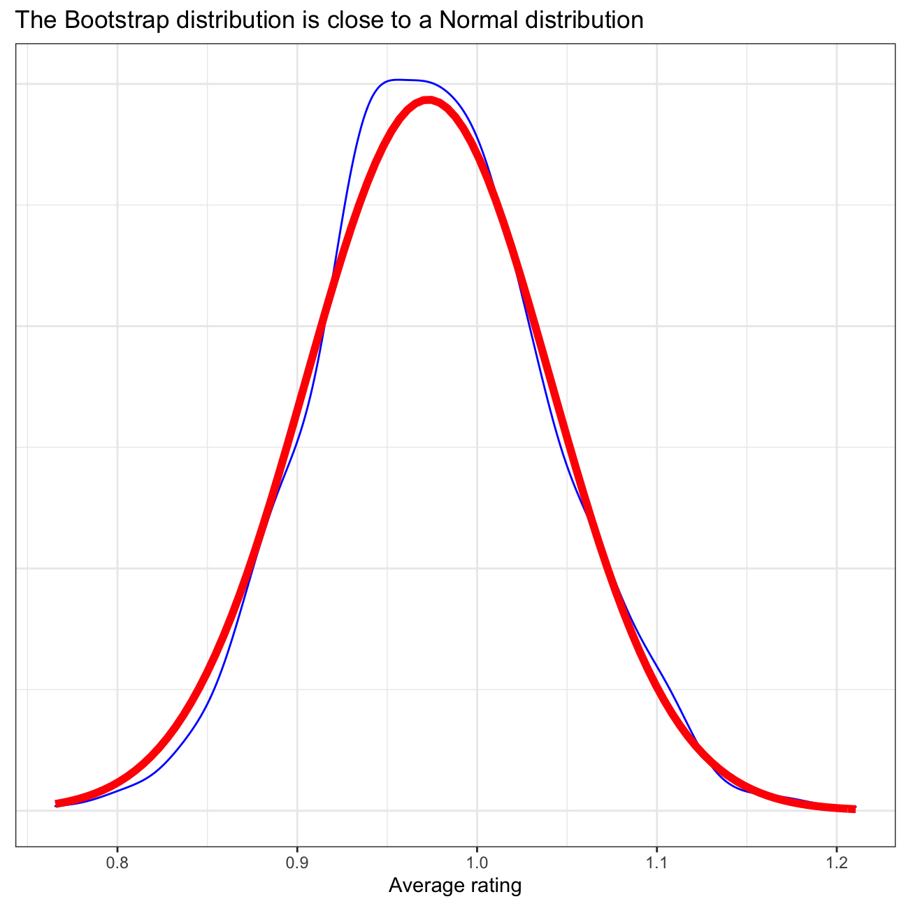
## 1 0.855 1.10In the above sections, the confidence interval has been calculated using 2 different method: using CI formula and using bootstrap. In the CI formula method, each year’s annual delta has been calculated by taking the arithmetic mean of all months’ delta in that corresponding year. This yields a total of 9 observations from 2011 until 2019. Then, the standard deviation of the data and standard error of the mean are calculated, and then combined with a t-statistic approximation to obtain a 95% confidence interval for the average annual delta. Meanwhile, in the bootstrap method, repeated samples are taken from the data to provide an estimate of the average annual delta. Using the 1st method, we are 95% confident that the actual average is between 0.816 - 1.13. Using the 2nd method, the confidence interval is narrower: 0.855 - 1.1, see the first plot below. Here, the bootstrap distribution is quite close to normal distribution, as is demonstrated in the second plot below, so the 2 confidence intervals should be similar to some extent.
# Visualise bootstrap CI vs formula CI
visualize(boot_yearly_mean_delta) +
  shade_ci(endpoints = percentile_ci,fill = "yellow")+
  labs(title='Bootstrap CI for Yearly Mean Temperature Deviation narrower than Formula CI',
       subtitle = 'Formula CI shown with dotted red lines, Bootstrap CI in green')+
  geom_vline(xintercept = formula_ci$delta_low, colour = "red", linetype="dashed", size=1.2)+
  geom_vline(xintercept = formula_ci$delta_high, colour = "red", linetype="dashed", size=1.2)+
  theme_bw()+
  NULL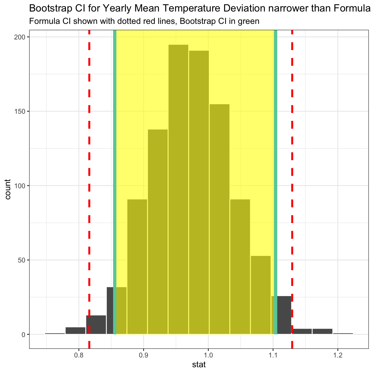
# compare bootstrap distribution with a Normal distribution with parameters estimated from the sample
ggplot(boot_yearly_mean_delta, aes(x = stat)) +
  geom_density(color="blue") +
  stat_function(
    fun = dnorm,
    color = "red",
    size = 2,
    args = list(mean = formula_ci$mean_delta, sd = formula_ci$se_delta)
  )+
  theme_bw()+
  labs(title = "The Bootstrap distribution is close to a Normal distribution",
       x= 'Average rating', y = "")+
  theme(axis.title.y=element_blank(),
        axis.text.y=element_blank(),
        axis.ticks.y=element_blank())+
  NULL