Financial Returns across DJIA

Returns of financial stocks
I will use the tidyquant package to download historical data of stock prices, calculate returns, and examine the distribution of returns from finance data sources. .
To first identify which stocks we want to download data for, we must know their ticker symbol; Apple is known as AAPL, Microsoft as MSFT, McDonald’s as MCD, etc. The file nyse.csv contains 508 stocks listed on the NYSE, their ticker symbol, name, the IPO (Initial Public Offering) year, and the sector and industry the company is in.
nyse <- read_csv(here::here("content","projects","project_returns","data","nyse.csv"))Lets briefly examine this dataset, to see the number of companies per sector, in descending order:
companies_per_sector <-
  nyse %>%
  count(sector) %>%
  rename(count_company = n) %>%
  arrange(desc(count_company))

companies_per_sector
## # A tibble: 12 x 2
## sector count_company
## <chr> <int>
## 1 Finance 97
## 2 Consumer Services 79
## 3 Public Utilities 60
## 4 Capital Goods 45
## 5 Health Care 45
## 6 Energy 42
## 7 Technology 40
## 8 Basic Industries 39
## 9 Consumer Non-Durables 31
## 10 Miscellaneous 12
## 11 Transportation 10
## 12 Consumer Durables 8ggplot(companies_per_sector, aes(y = reorder(sector, count_company), x = count_company))+
geom_bar(stat = "identity" ) +
labs(
title = "Companies per Sector on NYSE - Bar Plot",
x = "Sector",
y = "# of companies on NYSE"
)+
theme_economist()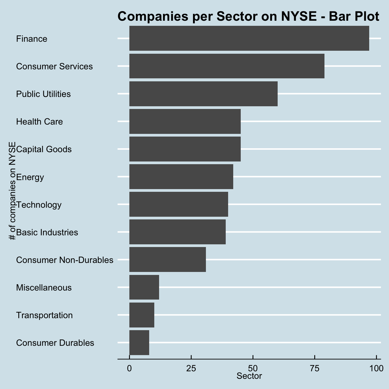
Next, I will choose the Dow Jones Industrial Aveareg (DJIA) stocks and their ticker symbols and download some data. Besides the thirty stocks that make up the DJIA, I will also add SPY which is an SP500 ETF (Exchange Traded Fund) as comparison.
djia_url <- "https://en.wikipedia.org/wiki/Dow_Jones_Industrial_Average"

#get tables that exist on URL
tables <- djia_url %>%
  read_html() %>%
  html_nodes(css="table")


# parse HTML tables into a dataframe called djia.
# Use purr::map() to create a list of all tables in URL
djia <- map(tables, . %>%
               html_table(fill=TRUE)%>%
               clean_names())


# constituents
table1 <- djia[[2]] %>% # the second table on the page contains the ticker symbols
  mutate(date_added = ymd(date_added),

         # if a stock is listed on NYSE, its symbol is, e.g., NYSE: MMM
         # We will get prices from yahoo finance which requires just the ticker

         # if symbol contains "NYSE*", the * being a wildcard
         # then we jsut drop the first 6 characters in that string
         ticker = ifelse(str_detect(symbol, "NYSE*"),
                          str_sub(symbol,7,11),
                          symbol)
         )

# we need a vector of strings with just the 30 tickers + SPY
tickers <- table1 %>%
  select(ticker) %>%
  pull() %>% # pull() gets them as a sting of characters
  c("SPY") # and lets us add SPY, the SP500 ETF
The next step is to collect the stock prices for all our tickers between 2000 and 31/08/2020.
myStocks <- tickers %>%
  tq_get(get  = "stock.prices",
         from = "2000-01-01",
         to   = "2020-08-31") %>%
  group_by(symbol)
Financial performance analysis depend on returns; If I buy a stock today for 100 and I sell it tomorrow for 101.75, my one-day return, assuming no transaction costs, is 1.75%. So given the adjusted closing prices, my first step is therefore to calculate daily and monthly returns.
#calculate daily returns
myStocks_returns_daily <- myStocks %>%
  tq_transmute(select     = adjusted,
               mutate_fun = periodReturn,
               period     = "daily",
               type       = "log",
               col_rename = "daily_returns",
               cols = c(nested.col))

#calculate monthly  returns
myStocks_returns_monthly <- myStocks %>%
  tq_transmute(select     = adjusted,
               mutate_fun = periodReturn,
               period     = "monthly",
               type       = "arithmetic",
               col_rename = "monthly_returns",
               cols = c(nested.col))

#calculate yearly returns
myStocks_returns_annual <- myStocks %>%
  group_by(symbol) %>%
  tq_transmute(select     = adjusted,
               mutate_fun = periodReturn,
               period     = "yearly",
               type       = "arithmetic",
               col_rename = "yearly_returns",
               cols = c(nested.col))
I will then create a dataframe and assign it to a new object, where I summarise monthly returns since 2017-01-01 for each of the stocks and SPY; min, max, median, mean, SD.
monthly_returns_17_to_20 <-
  myStocks_returns_monthly %>%
  filter(date  >= as.Date("2017-01-01")) %>%
  group_by(symbol) %>%
  summarise(mean_monthly_returns = mean(monthly_returns),
            median_monthly_returns = median(monthly_returns),
            std_monthly_returns = sd(monthly_returns),
            min_monthly_returns = min(monthly_returns),
            max_monthly_returns = max(monthly_returns)) %>%
  arrange(desc(mean_monthly_returns))   # Arrange for mean return to have a better overview
Lets have a look at the distirbution of each stock#s return over the past years!
ggplot(myStocks_returns_monthly, aes(monthly_returns)) +
  geom_density() +
  geom_vline(aes(xintercept=mean(monthly_returns)), # Add a mean line for clarity
            color="red", linetype="dashed", size=0.5) +
  facet_wrap(vars(symbol)) +
  labs(
    title = "Monthly Return Distribution by Stock",
    x = "Monthly Returns",
    y = "Density"
  )+
  theme_economist()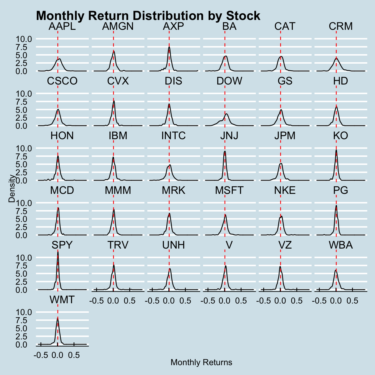
This density plots show us two things in general:
- In which region do the most common returns lie (i.e. where is the mean)
- How widely spread are the returns (i.e. what is the variance)
These two points can be then be used to assess the overall performance of the stock over the past years and the risk associated with them.
Looking only at the plots we can see that DOW and AAPL are very widely spread and are therefore the riskiest stocks. On the other side of the spectrum we have the SPY ETF, which is to be expected as its an index fund that is well diversified.
We will now create the typical risk vs return plot, were we plot expected monthly return (mean) of a stock on the Y axis and the risk (standard deviation) in the X-axis.
monthly_returns_17_to_20## # A tibble: 31 x 6
## symbol mean_monthly_re… median_monthly_… std_monthly_ret… min_monthly_ret…
## <chr> <dbl> <dbl> <dbl> <dbl>
## 1 AAPL 0.0387 0.0513 0.0873 -0.181
## 2 CRM 0.0350 0.0403 0.0850 -0.155
## 3 MSFT 0.0327 0.0288 0.0503 -0.0840
## 4 V 0.0253 0.0281 0.0520 -0.114
## 5 NKE 0.0213 0.0271 0.0672 -0.119
## 6 HD 0.0213 0.0252 0.0626 -0.151
## 7 WMT 0.0196 0.0257 0.0535 -0.156
## 8 UNH 0.0186 0.0211 0.0637 -0.115
## 9 AMGN 0.0171 0.0235 0.0664 -0.104
## 10 MCD 0.0164 0.0157 0.0534 -0.148
## # … with 21 more rows, and 1 more variable: max_monthly_returns <dbl>ggplot(monthly_returns_17_to_20, aes(x = std_monthly_returns, y = mean_monthly_returns)) +
geom_point() +
geom_text_repel(aes(label = symbol),
size = 2.5) +
expand_limits(x = 0, y = 0) + # set x and y axis to begin at 0 for clarity
labs(
title = "Risk vs Return Plot - DJIA",
x = "Monthly Return Standard Deviation",
y = "Mean Monthly Return"
) +
theme_economist()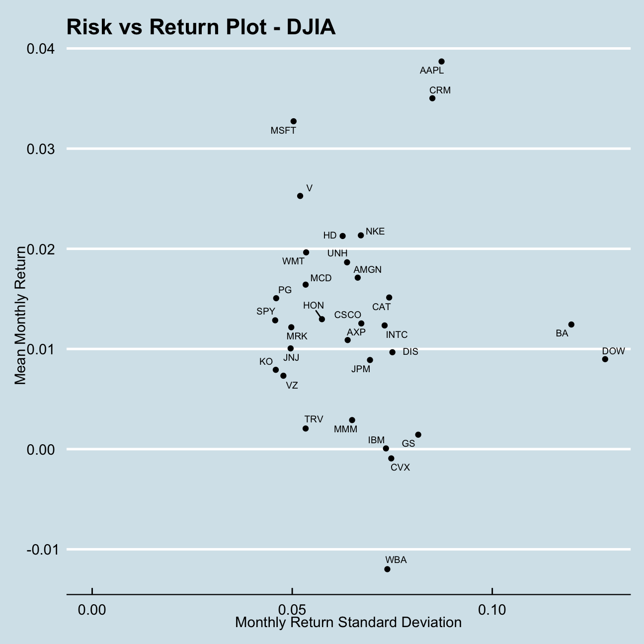
In finance there is a general expectation of returns being related to risk. In that sense we would be expecting to see a positive correlation between the stocks mean returns and return standard deviation. Any deviation from this means a stock is less attractive then the other. We would always choose a less risky stock with the same return as another stock.
Notably strong stocks (being less risky than would have been expected for the achieved returns) are:
- Apple (AAPL)
- Salesforce (CRM)
- Microsoft (MSFT)
Notably weak stocks (being more risky than would have been expected for the achieved returns) are:
- Walgreens (WBA)
- Chevron (CVX)
- IBM (IBM)
If one had to choose only one stock with the above information it would be one of Apple, Salesforce or Microsoft which outperform the remaining sample in terms of achieved returns for taken risk.